Noah Graham/NBAE via Getty Images
The NBA’s in-season tournament is back for its second go-round, and this time it got a full rebrand as the Emirates Cup.
We got a major refresh on the courts for each of the 30 teams, too. And below, we’re going to rank them all on aesthetics.
Of course, this is mostly a subjective pursuit. Opinions are bound to vary. Some might prefer simplicity. Others, like me, might think if you’re going to install a bright, wild court, you might as well go all the way and add some intricate design. Even better if it’s a nod to the team, its culture or its city.
Some may like the bright reds, greens or blues. Others might think those surfaces are little more than fodder for Seinfeld memes.
Whatever approach you have is fine. Just know that the one below is right.
30. Detroit Pistons
NBA.com
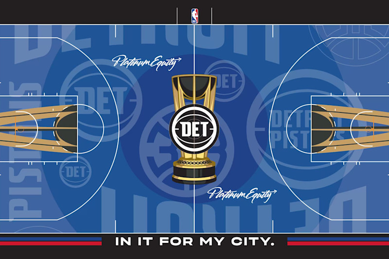
The Detroit Pistons’ floor is a mess. It can’t make up its mind. There’s a handful of different logos, some of which are falling off the court. It’s unbalanced, too.
On one end, a big, circular Pistons logo frames the top of the key. On the other, a smaller one is off-center.
The contrast between the dark blue and the color of the cup itself isn’t bad, but it’s hard to find a lot of other positives.
29. Cleveland Cavaliers
NBA.com
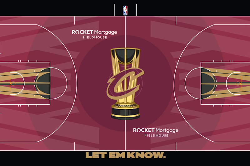
The wine and gold on the Cleveland Cavaliers’ court looks good. Those colors contrast each other well, and the black helps them pop, too.
But the design on the floor and motto on the sideline couldn’t be much more generic.
The former looks like a net draped off the trophy at center court. The latter seems like it was AI-generated for a team asking, “What’s a cool motto for a basketball team?”
And both could very easily apply to any of the 29 other teams in the league.
28. Atlanta Hawks
NBA.com
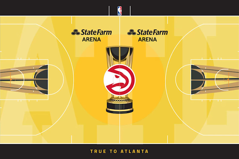
The Atlanta Hawks’ design is just sort of bleh, which seems inexcusable for a city that’s long been a cultural hot spot for music and is becoming one for TV and movies.
The primary color isn’t much of a stretch from what you typically see on an NBA floor. And the superimposed “ATL” seems like the most basic and obvious way to signal, “Yes, this is the Hawks’ arena.”
Kudos for going with the best logo in the team’s history at center court, but Atlanta could’ve leaned a lot harder into that (or really, anything else).
27. Phoenix Suns
NBA.com
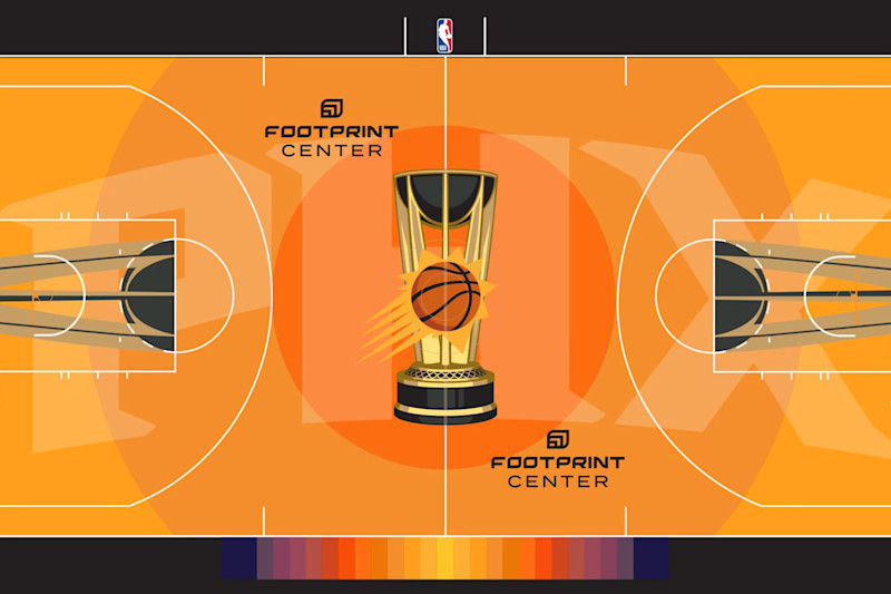
The Phoenix Suns are another team that seems to have just slapped the shortened version of their location on the floor and called it good.
Purple and orange is a solid one-two punch in terms of color, and Phoenix isn’t even throwing the purple out there (at least not in a real way).
A more obvious nod to the logo and a splash of atypical color would’ve helped. Heck, even that gradient on one sideline would’ve been cool in an expanded role.
26. Indiana Pacers
NBA.com
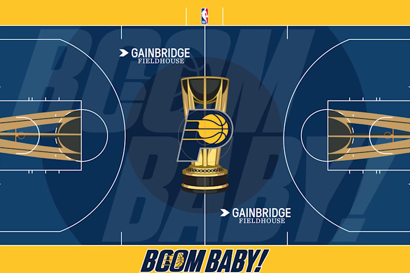
The phrase “Boom baby!” may generate a lot of nostalgia for local fans, but it’s a bit of a head-scratcher for those who aren’t familiar with longtime Indiana Pacers broadcaster Bobby “Slick” Leonard.
That doesn’t mean Indiana should’ve avoided the catchphrase altogether. It’s fine on the sideline. But a nod to the logo, race cars or something else Indiana-centric would’ve made sense for the playing surface.
Yellow and blue is always a nice combination of colors, but it can only do so much for a relatively obscure line that’ll require some explanation from commentators (at least for the non-Pacers fans).
25. Miami Heat
NBA.com
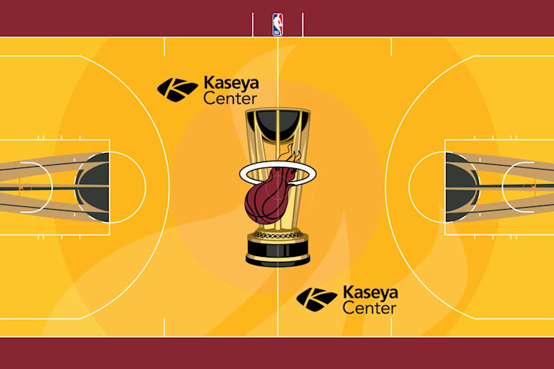
The Miami Heat were clearly going for the “keep it simple, stupid” approach, and that certainly appeals to a lot of viewers.
But the primary color here is too close to that of the trophy. The edges of the flames are cool, but maybe a little too subtle.
In all, this one just feels an awful lot like something that could be the everyday court for the Heat, which sort of defeats the purpose of this endeavor.
24. Toronto Raptors
NBA.com
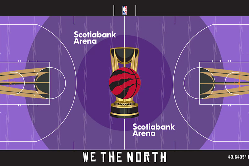
Purple is cool, if only because it’s relatively unique among NBA teams. The Toronto Raptors get some credit for picking the right color scheme. Some of the best jerseys in team history featured the red and purple above..
But there’s not enough red to contrast the purple here. And the design is a little too simple.
Concentric circles with overlayed zig zags don’t really suggest dinosaurs. Are those lines claw marks? Because they look more like Shazam’s logo repeated over and over.
23. Sacramento Kings
NBA.com
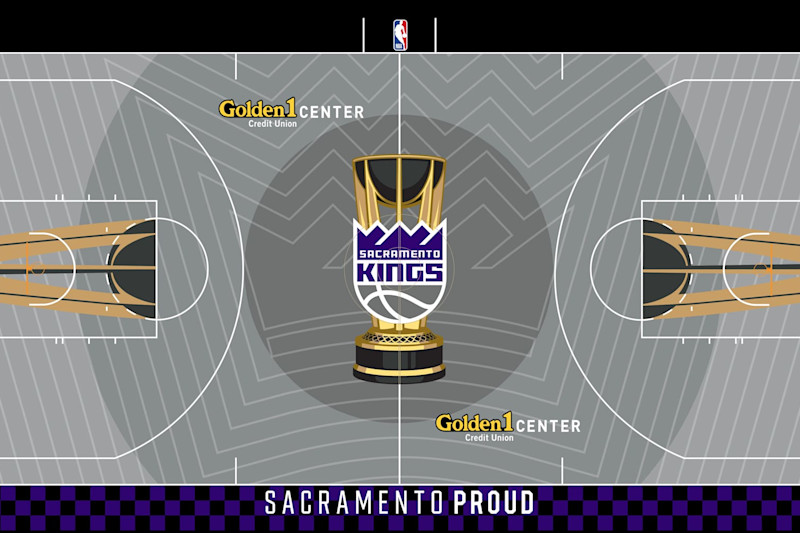
Kudos to the Sacramento Kings for going with the gray. That’s typically a good choice, especially when it’s a backdrop for bright, vibrant jerseys.
But this court could use an awful lot more purple. And while the crown overlayed at center court is a good and obvious nod to the team name, the rest of the design is too much.
The lines look like a middle-school doodle in your history notebook. Who among us hasn’t drawn a shape, and then enclosed that shape with a bigger shape (over and over and over)?
It was a good time burner, but it’s not the best idea for an NBA basketball court.
22. Denver Nuggets
NBA.com
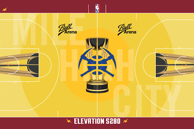
The phrase “Mile High City” feels more mainstream than “Boom Baby,” but probably not by a lot.
And the decision to go with the various shades of yellow on the playing surface earns the same knock the Atlanta Hawks got.
It all feels a little too safe, especially when the Denver Nuggets have something like those 1980s skyline designs hidden somewhere in the locker.
21. Los Angeles Clippers
NBA.com
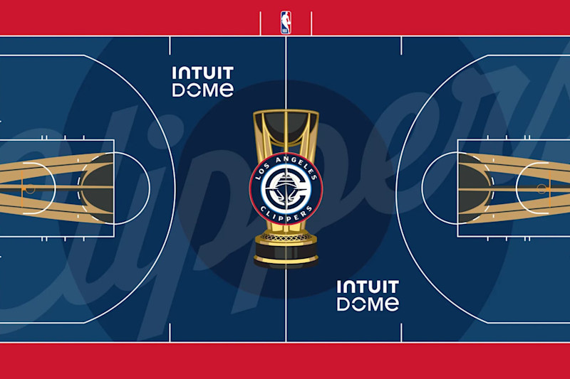
The Los Angeles Clippers inched up a bit higher than those below based almost entirely on how well red and blue work together. It’s a tried-and-true combination that looks even better when you darken the blue a bit.
The logo of a clipper ship works here, too And the simple, cursive “Clippers” may appeal to those into more simple designs.
But this is another one that just feels a little too safe. There’s nothing on the sidelines, and one fan’s “simple” may be another’s “bland.”
20. Memphis Grizzlies
NBA.com
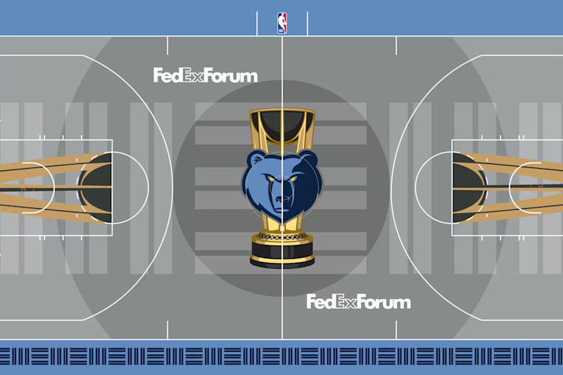
As you’ll see later in the slideshow, a gray floor is often a shortcut to some imaginary bonus points. And the Memphis Grizzlies get a little credit for trying a unique design.
But that unique design doesn’t really scream “grizzly bear.” And while the more modern logo obviously gives that away, I would’ve liked a less subtle approach.
Like the Nuggets, Memphis has some awesome, vibrant designs in their history. The teal and red of the Vancover era made for a great contrast. And the court could’ve used some superimposed claw marks or snarling teeth.
Bears can be pretty menacing, and the Grizzlies court should be too!
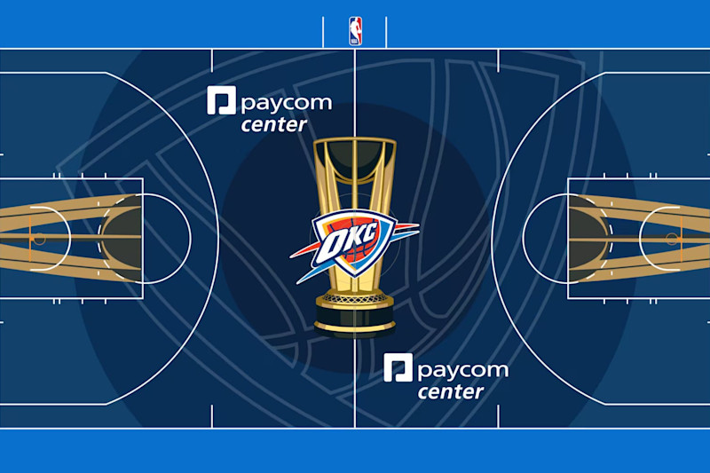
19. Oklahoma City Thunder
NBA.com
We come now to what seems like something of a subgenre of courts for this round of the in-season tournament: the team logo behind the team logo.
It’s simple but effective, especially when accompanied by a solid color scheme and good logo.
The Oklahoma City Thunder don’t really check those two boxes as well as some other teams, though.
Blue is pretty universally beloved, but a little orange may have helped it pop a little more. And as far as logos go, OKC’s is a little bland.
18. Brooklyn Nets
NBA.com
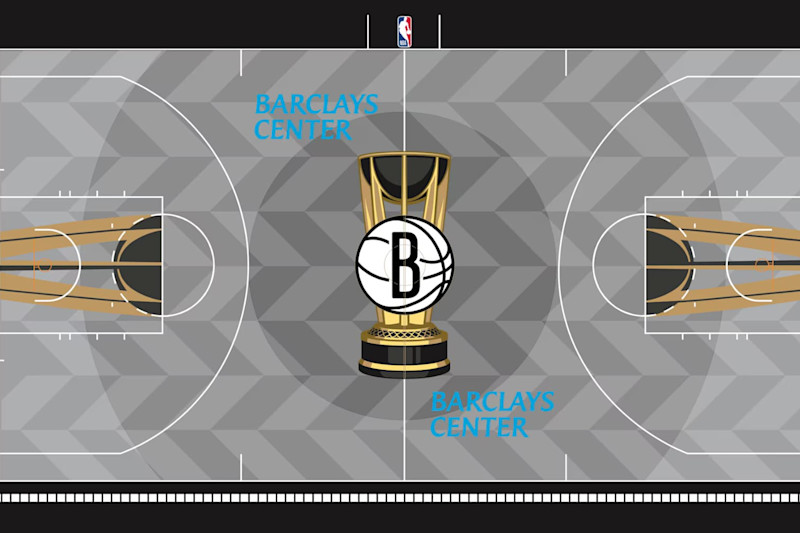
From here on out, we’re looking at courts that are at least solid. And the Brooklyn Nets’ gray floor is a good example of how to do simple right.
The concentric circles over the top of the parallelograms (or vice versa) works. The black, white and gray all complement each other well. The color of the trophy pops off the gray.
And the nod to New York’s subway system, with the tiling on the sideline and font on the baselines, is perfect.
17. New Orleans Pelicans
NBA.com
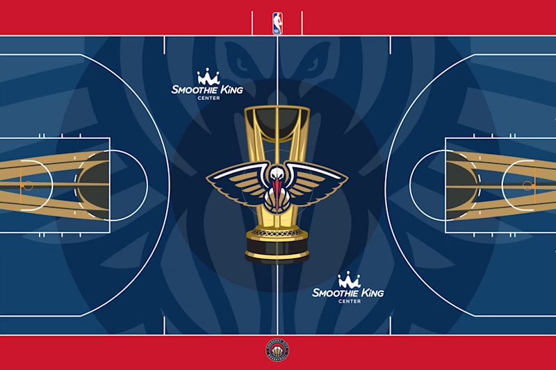
Another example of the logo on top of the logo, the New Orleans Pelicans’ floor executes the concept a bit better than OKC.
For one thing, red and blue looks a little better than blue and blue. And the Louisiana-inspired font on the baselines is a good nod to local culture.
But the biggest reason this one is a couple spots above the Thunder is how much better the Pelicans logo is. The Pelican looks cool, and the eyes on the bigger version are a little menacing and placed perfectly.
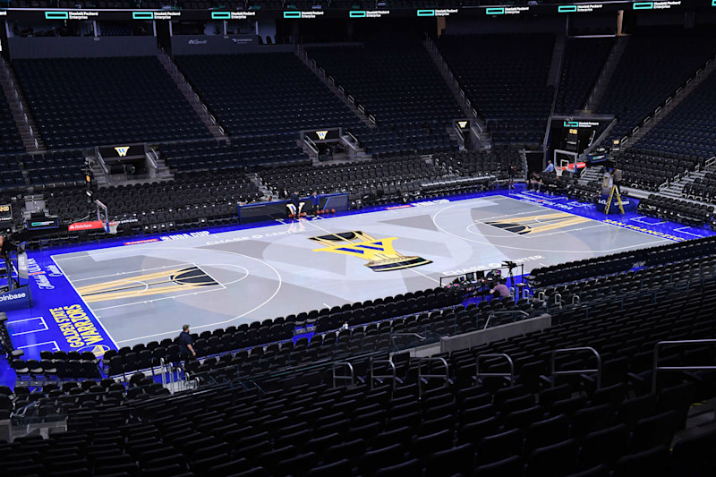
16. Golden State Warriors
NBA.com
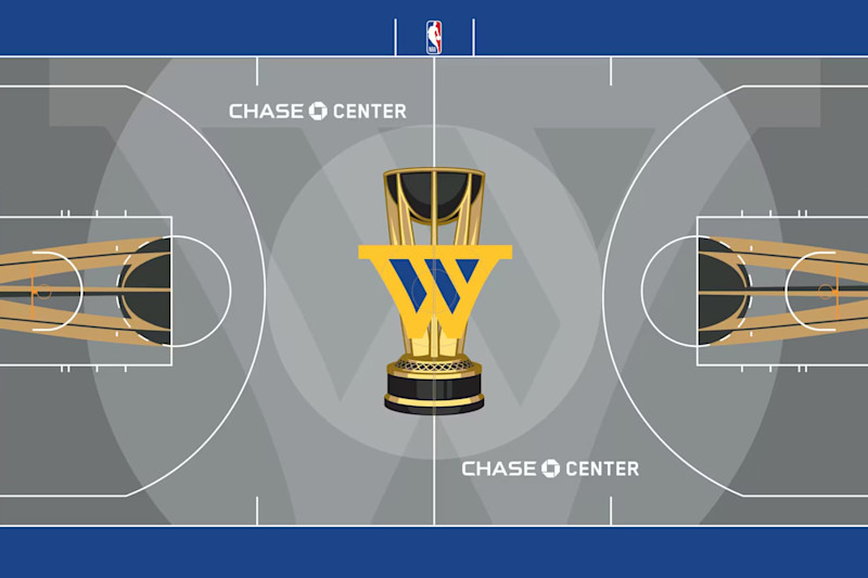
The Golden State Warriors give us another look at how simplicity can work.
Again, the gray is a good way to go, especially when the Warriors are wearing some of their dark uniforms on top of it (as they did in their NBA Cup opener).
Blue and yellow is a good combo, too. And using both as accent colors is smart.
This one also features a pair of designs within the primary color (like Brooklyn). And the circles and giant W work together pretty well.
15. Boston Celtics
NBA.com
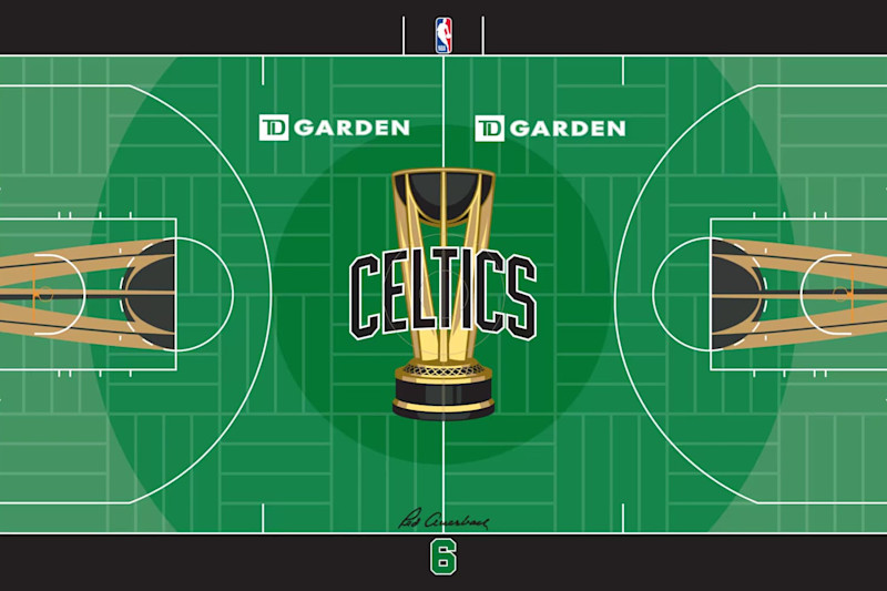
Black still feels a little weird for the Boston Celtics. That simple combination of white and green that they rocked for their titles in the 1960s, ’70s and ’80s is almost synonymous with the team.
So, it might be interesting to see a similar design with white in place of black. But this one might actually make the green pop a little more. And kudos to the Celtics for leaning into that primary color.
The subtle reference to the old parquet floors is nice, too. As is the Bill Russell tribute on the sideline.
Could the Celtics have been a bit more bold? Would a shamrock have been cool? Sure, but this is still a fun, green court in a league that hasn’t given us many green courts.
14. Chicago Bulls
NBA.com
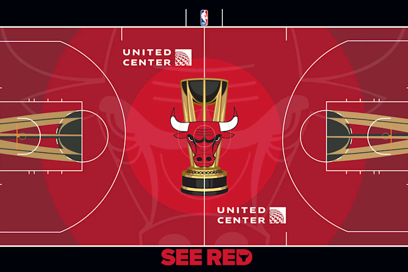
The Chicago Bulls have one of the coolest logos in the history of pro sports. So, making that the focus was smart.
The superimposed silhouette behind the actual logo is, once again, a simple but effective way to do that.
Chicago deserves some credit for embracing the deep red, too. Although, I understand where the “it’s too red” fans are coming from.
We’ve grown accustomed to wooden floors that typically look like wood. The bright red can be a little jarring if you’re not used to it.
13. Milwaukee Bucks
NBA.com
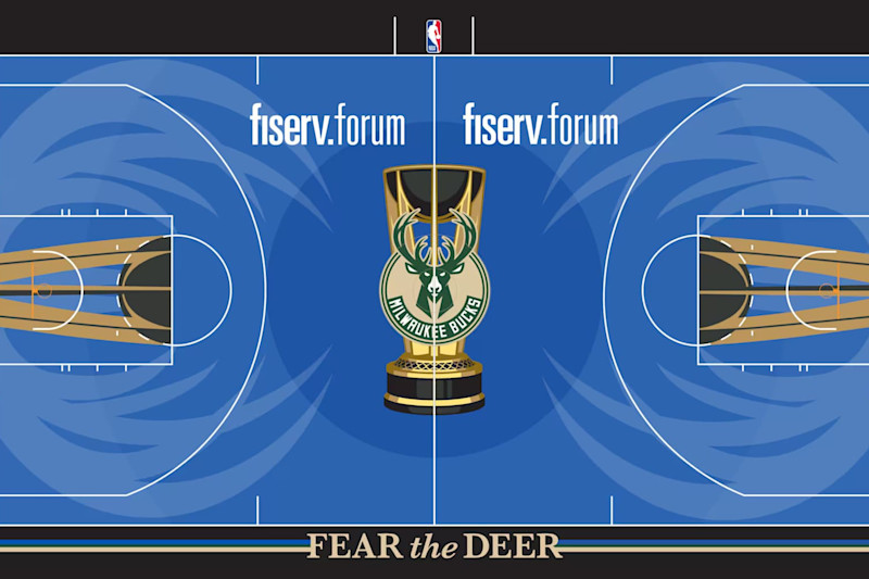
The Milwaukee Bucks’ cream and blue color scheme is their best, so going with that is smart.
Using blue as the primary color works, too, in part because the cream-colored floor would’ve looked like a typical pre-in-season-tournament court.
But one of the biggest reasons this floor snuck into the top half of the exercise is those antlers. They perfectly frame the paint on either end of the floor. They’re obviously a reference to the Bucks, but they don’t hit you over the head with that fact.
Accenting everything with black works too. And the stripes coming off one of the better mottos in the league on the sideline is a nice detail.
12. San Antonio Spurs
NBA.com
The San Antonio Spurs have one of the league’s simplest and most iconic jerseys and overall looks.
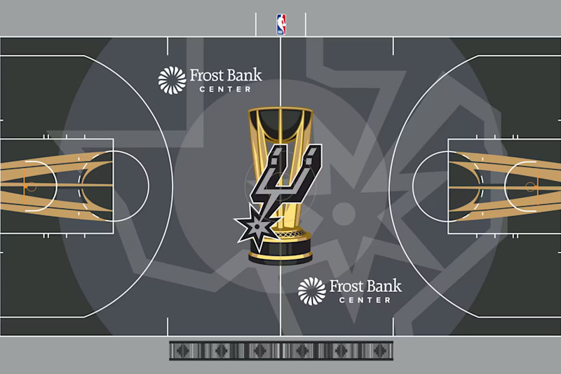
It’s tough to make black, white and gray stand out as original and unique, but the Spurs have managed to do so for years.
In the case of this court, the darker gray in the middle and black near the baselines provide good backdrops for the trophy designs that are on all the Cup floors. The slightly more dramatic gradient effect is nice, too.
And the enlarged logo superimposed behind the basic one is a nod to both the team and the state it plays in.
As a final touch, San Antonio added one more nod to its region with the pattern on the sideline.
11. Dallas Mavericks
NBA.com
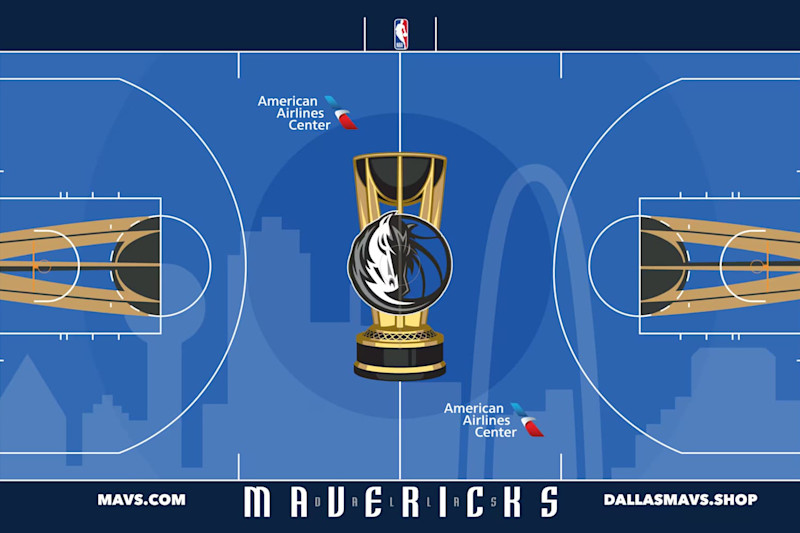
The Dallas Mavericks give us a first in another subgenre of NBA Cup floors: the overlayed city skyline.
And while the concept is cool, Dallas doesn’t quite execute it as well as others. For one thing, the Dallas skyline isn’t all that iconic outside of Dallas (how many non-Texans see an arch and instantly think of St. Louis?). Blue accenting blue may not be as effective as white or gray would’ve been. And the URL addresses feel a little gratuitous.
But this one is still a fringe top-10 floor, thanks to a sharp logo, good primary color and (again) the skyline.
10. Philadelphia 76ers
NBA.com
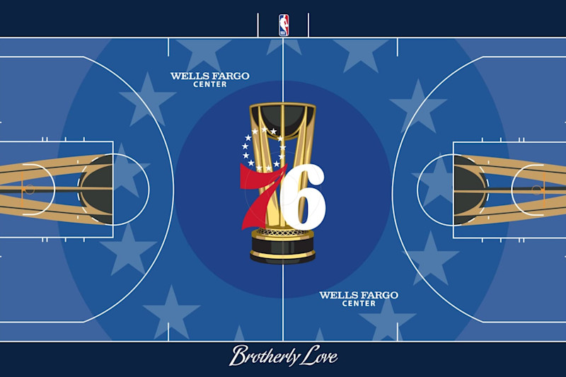
The Philadelphia 76ers are another team with an iconic image and logo. And putting one of those classic images front and center was smart.
Philadelphia was also smart to include a nod to the team that was a little more subtle than the logo behind the logo. The stars within the concentric circles look good.
And though some of the previous teams have been knocked for going with a secondary color that’s just a different shade than the primary, the Sixers’ accent is dark enough to still be a clear contrast. The italics-looking font and timeless “Brotherly Love” are nice inclusions, too.
9. Orlando Magic
NBA.com
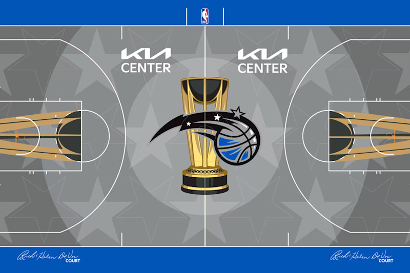
This one has a lot of features similar to Philadelphia. Concentric circles, stars and a little bigger logo aren’t unique, but they still work here.
Acknowledging the fantasy in the Orlando Magic’s name was smart, too.
And what really sets this one apart from the 76ers is the starker contrast between gray and royal blue.
Ultimately, this is another one that’s simple without being too simple. It’s clean without being boring.
8. Utah Jazz
NBA.com
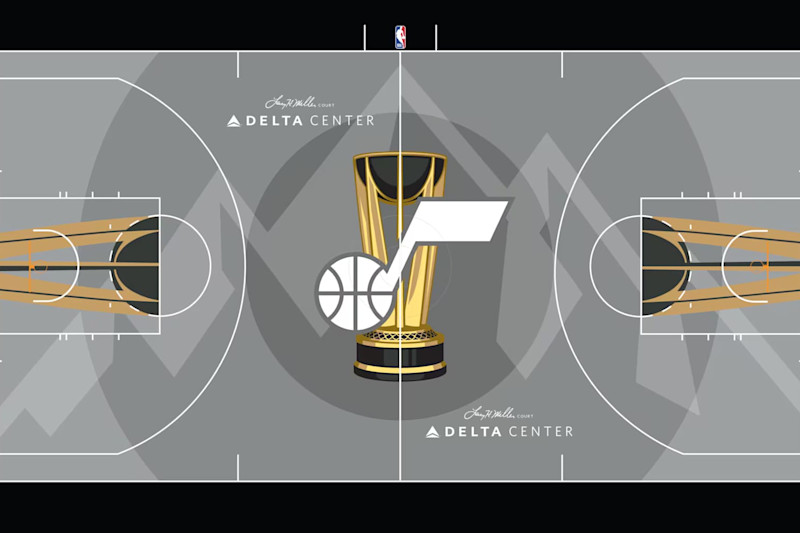
The black and highlighter yellow jerseys the Utah Jazz have rocked for a few years don’t really make sense (which is why that rebrand probably won’t last much longer), but current color scheme and font seen on these baselines actually work quite well with this court.
This is another team that went with a simple, largely gray approach, but they maximized it.
The white logo looks great against the gray backdrop. And using the mountains as the overlay was smart.
Would the entire thing have looked better with Utah’s heavily purple scheme from the 1990s? Maybe, but this is still a clear winner.
7. Washington Wizards
NBA.com
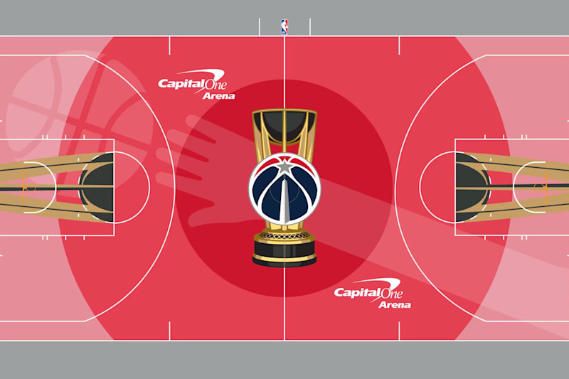
Maybe it’s just because I’m older than most of the players in the league, but a nod to nostalgia is an easy way to gain my support.
And the Washington Wizards’ nod to the old Bullets logo is great here.
Washington took the “logo behind the logo” concept and spun it a bit. It has the more modern ball, star and Washington monument at center court, on top of the Cup and a silhouette of the hand tapping the ball that you saw across the chest of Wes Unseld, Elvin Hayes and Manute Bol.
The concentric circles pop a little more on this one than they do on other floors, too (thanks to a more dramatic color gradient). And the gray framing from the sidelines and baselines works too.
6. Los Angeles Lakers
NBA.com
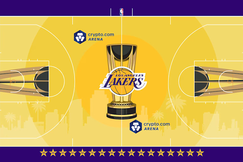
Like Dallas, Los Angeles may not be known for its skyline quite as much as it is for other local features, but the Lakers inclusion of palm trees is a nice touch.
And though other organizations have been knocked for going with a primary color that’s a little too close than the pre-Cup courts, you can’t really expect this iconic organization to go with anything but purple and gold. And for this team, the darker shade has typically been the accent.
This court also has the added feature of those stars on the sideline. They can be seen as both a reference to the star-studded city the Lakers play in and as acknowledgements of all the titles L.A. has won. The year of a championship is contained in each of the stars.
5. Houston Rockets
NBA.com
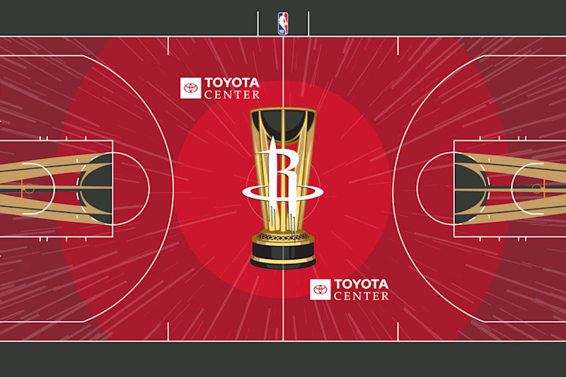
The Houston Rockets gave us a beautiful example of a court that includes a lot of the features that have been touted already.
Red is a bold color choice. The colors of the circlers are different enough to really stand out from each other. The logo is simple. And the black is a good outline for everything.
But the coolest feature here is those lines flying off the middle of the floor. The logo and trophy look like they’re taking off, which is a perfect reference to the team that doesn’t need to be explained but also isn’t overly obvious.
4. New York Knicks
NBA.com
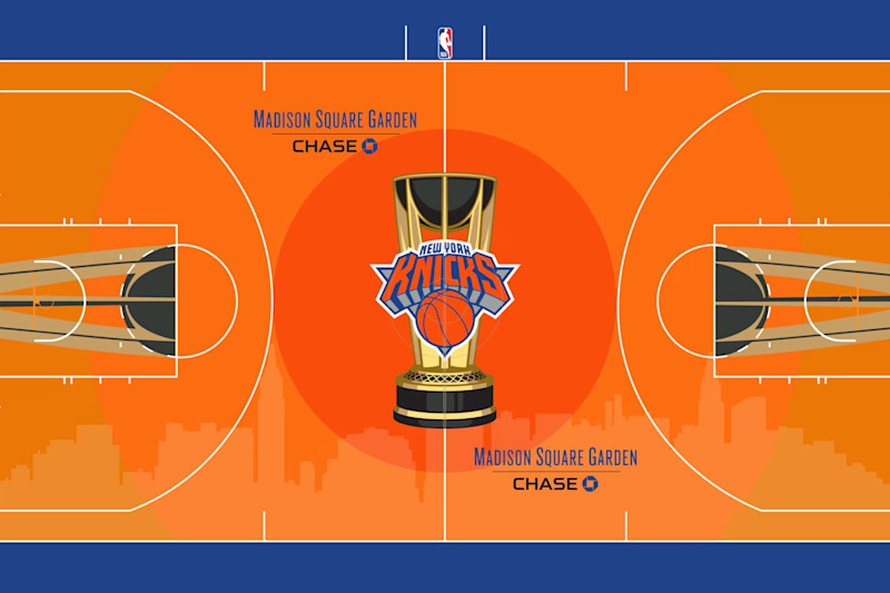
OK, now we have a iconic, well-known skyline. In fact, when plenty hear that word, their minds probably go to New York immediately.
So, that design was the way to go for the Knicks. And while orange (especially the lighter orange) may look a little like a typical wooden floor, this is another one of the NBA’s classic color schemes.
New York’s blue and orange are good contrasts for each other, so including both makes sense. And that timeless Knicks logo in the middle is another no-brainer.
3. Charlotte Hornets
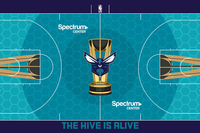
NBA.com
“The Hive is Alive” is a fun saying on the sideline (plenty of others above are just corny). Though some of the Charlotte Hornets’ historic logos may be a little cooler than this modern one, it’s still sharp.
But the Hornets crack the top three here for a couple primary reasons.
First, those colors. The primary teal is unique. And the dark purple is a perfect complement to it. It’s not a carbon copy of the scheme on the 1990s jerseys that everyone remembers, but it still evokes thoughts of that era.
And perhaps even cooler than the colors, that honeycomb overlay is just right.
2. Minnesota Timberwolves
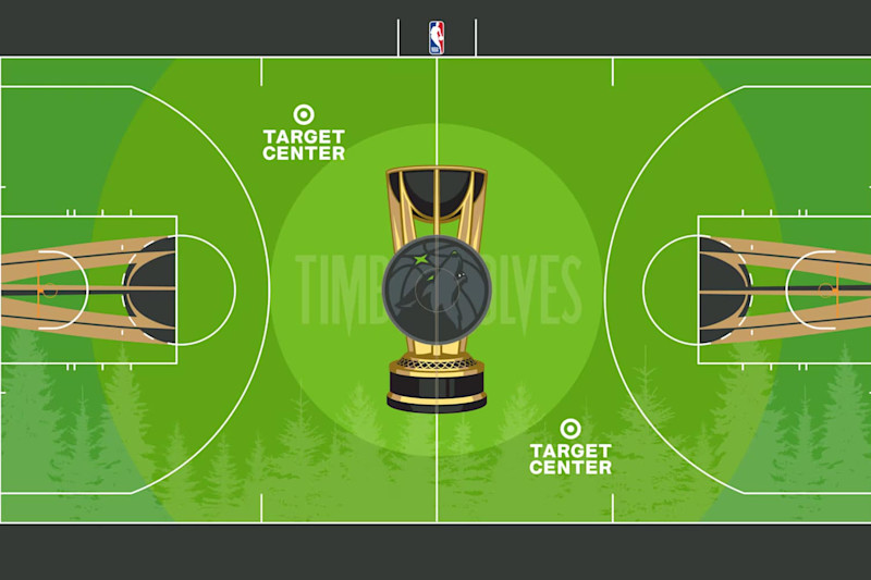
NBA.com
Like plenty of their jerseys during this current, Nike-branded period, the Minnesota Timberwolves’ NBA Cup court represents a big swing.
And it wouldn’t be all that surprising if the bright-to-dark green gradient turns a lot of fans off.
But they get points for embracing green, something a lot of other teams can’t (or wouldn’t) do. It’s a clear embrace of the mascot’s home. As is the silhouette of a forest along one sideline.
The accent along both baselines and sidelines is strong, too
1. Portland Trail Blazers
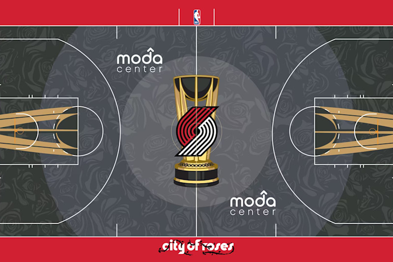
NBA.com
There are a lot of strong designs in this year’s crop of NBA Cup courts, but the Portland Trail Blazers still felt like the obvious pick for No. 1.
The dark gray-to-black gradient behind the classic Blazers logo looks sharp. The contrast between that and the bright red sidelines and baselines makes the playing surface really pop. Vines intertwining “City of Roses” is a nice touch, too.
But the biggest reason Portland rose as high as it did are those roses overlaying the dark floor. They’re a perfect, unique accent to the floor that’s also a nod to the region.
Leave a Reply