The WNBA and Nike rolled out an extensive revamp of uniforms across the league in 2021 ahead of its 25th season in light of its booming popularity and evolution. The league released three new designs for each team, debuting the heroine edition, explorer edition and rebel edition.
There have been a few tweaks since, such as upgrades to six teams’ rebel editions ahead of this season. Now that the league is raking in record jersey sales in 2024, let’s see how some of the uniforms have held up, how some have evolved and the meanings behind some of the details as we power-rank the best active WNBA jersey sets.
We’ll take all three active jerseys—heroine, explorer and rebel, into consideration for each team’s ranking.
12. Indiana Fever

Caitlin Clark in the heroine editionJustin Casterline/NBAE via Getty Images
I’m sorry, folks, and I assure you there’s not much I want more than to love the Indiana Fever’s jersey collection. Even one sick Fever jersey would be great for the WNBA, but guess what? My opinions and gripes clearly don’t matter—Caitlin Clark’s jersey is the top-selling W jersey this year amid record sales across all teams.
There’s nothing wrong with the Fever’s jerseys, but all three are just too generic to move the needle. I understand the new (as of 2023) rebel edition‘s homage to the Red-Outs during the Fever’s 2012 run, and I appreciate the important dates etched in the pinstripes as the Fever enter a new era.
But I appreciated the originality and execution of the former Stranger Things-themed rebel alternates, especially when the standard uniforms are so basic.
11. Dallas Wings

Odyssey Sims in the heroine editionJavier Vicencio/Eyepix Group/LightRocket via Getty Images
Just like the Fever’s, there’s nothing egregiously wrong with the Dallas Wings’ uniform set. But I’m never going to write home about the combination of highlighter yellow and blue. I do appreciate the subtlety of the inherently not-subtle color combo on both the homes and aways, and I like the font choices.
But the thirds are just too much for me:
10. Minnesota Lynx
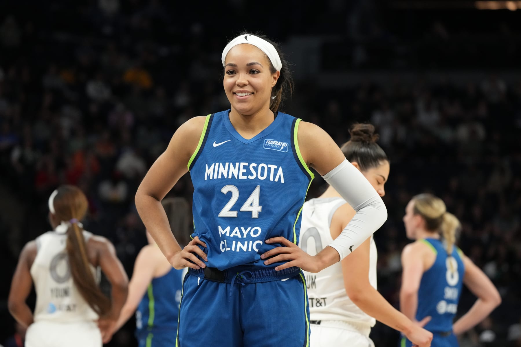
Napheesa Collier in the explorer editionJordan Johnson/NBAE via Getty Images
Again with the highlighter green/yellow and blue combination. Why must we as a society keep doing this?
The Minnesota Lynx get a slight edge over the Wings for the black and highlighter third. Black is really the only way to go when it comes to a highlighter moment of any sort.

Bridget Carleton in the rebel editionJordan Johnson/NBAE via Getty Images
9. Washington Mystics
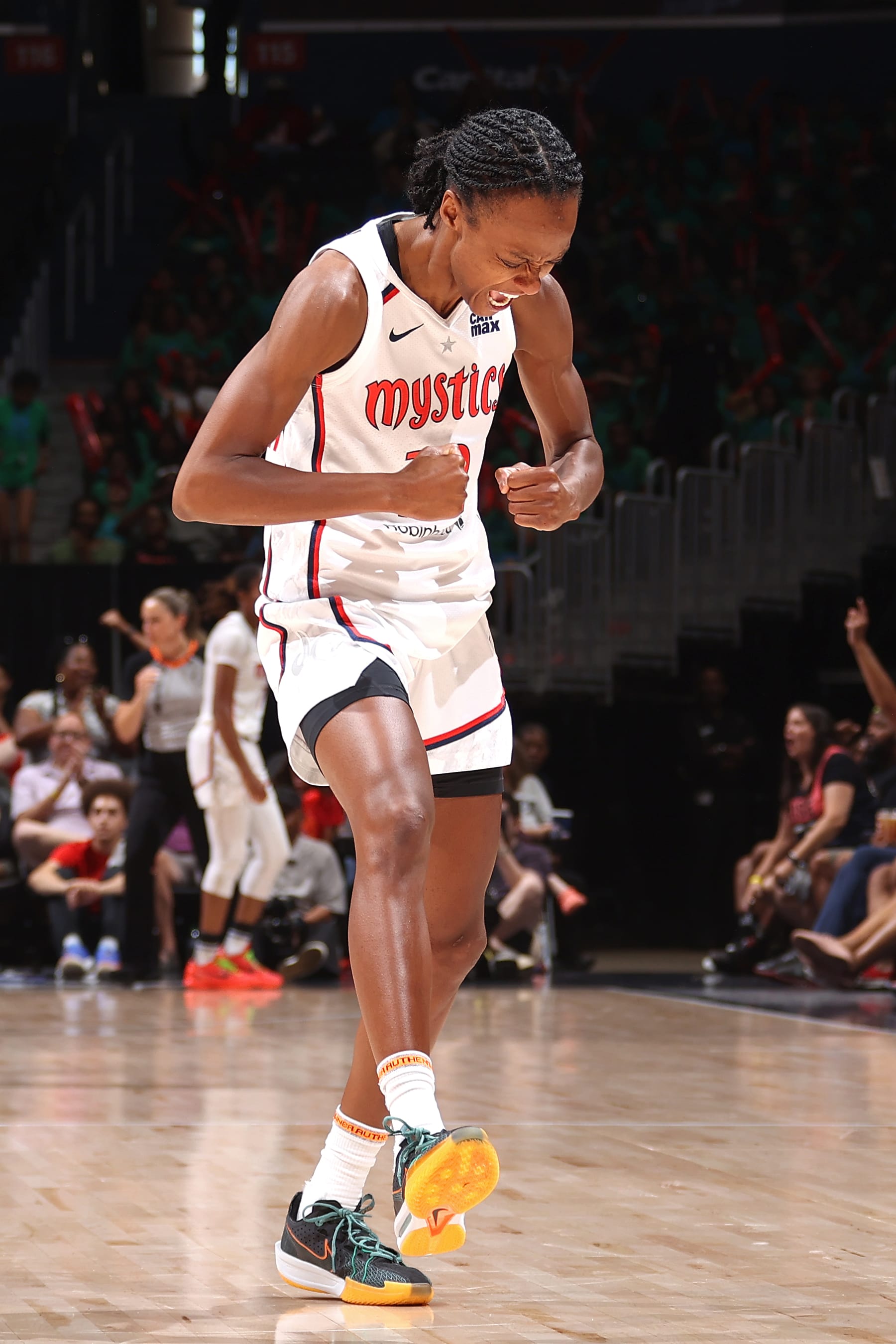
Shitori Walker-Kimbrough in the heroine editionKenny Giarla/NBAE via Getty Images
The Washington Mystics’ jersey font is like if comic sans, Walt Disney and a secret third Pirate-like thing had a baby, and somehow I don’t hate it. There are the obvious nods to the nation’s Capital with the one star and the red, white, and blue aspects, but I like the juxtaposed levity the font brings.
I will say, I loved the former pink-infused rebel editions and I’m salty about the change.
8. Las Vegas Aces
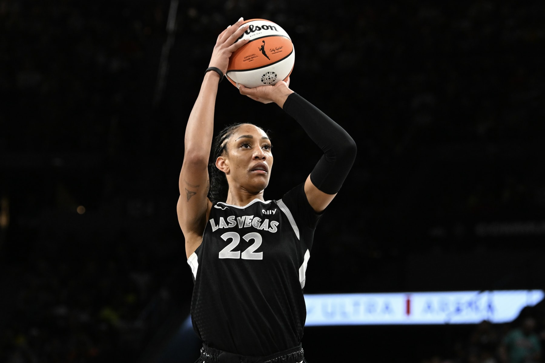
A’ja Wilson in the rebel editionCandice Ward/Getty Images
Is it an unpopular opinion to say every current Las Vegas Aces jersey sort of bores me? Why does it always feel like absolutely nothing about the Aces is boring except their jerseys?
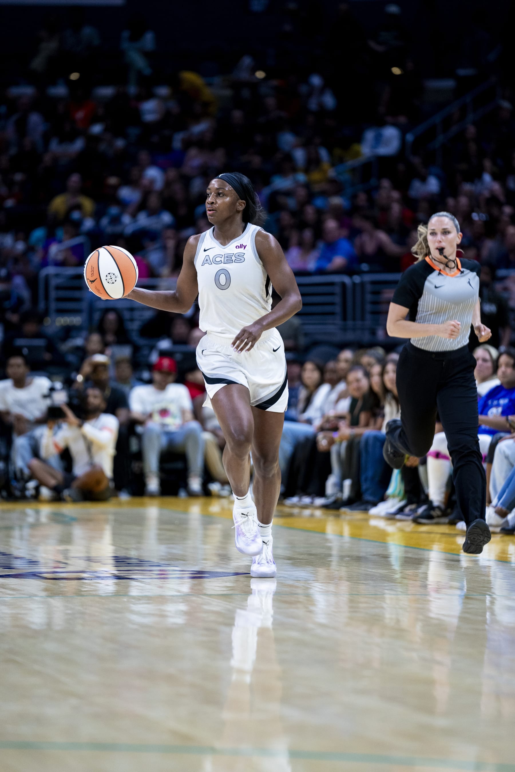
Jackie Young in the heroine editionTyler Ross/NBAE via Getty Images
Maybe that’s the point they’re trying to make? I wish it wasn’t. The silver has too much potential for this execution.
7. Connecticut Sun

DiJonai Carrington in the explorer editionEvan Yu/NBAE via Getty Images
I love that the Connecticut Sun always pay homage to the Mohegan Tribe with their alternates that say “Sun” in the Mohegan language across the chest.
I also tend to like a pop of Orange in my life. Sue me.
6. Seattle Storm
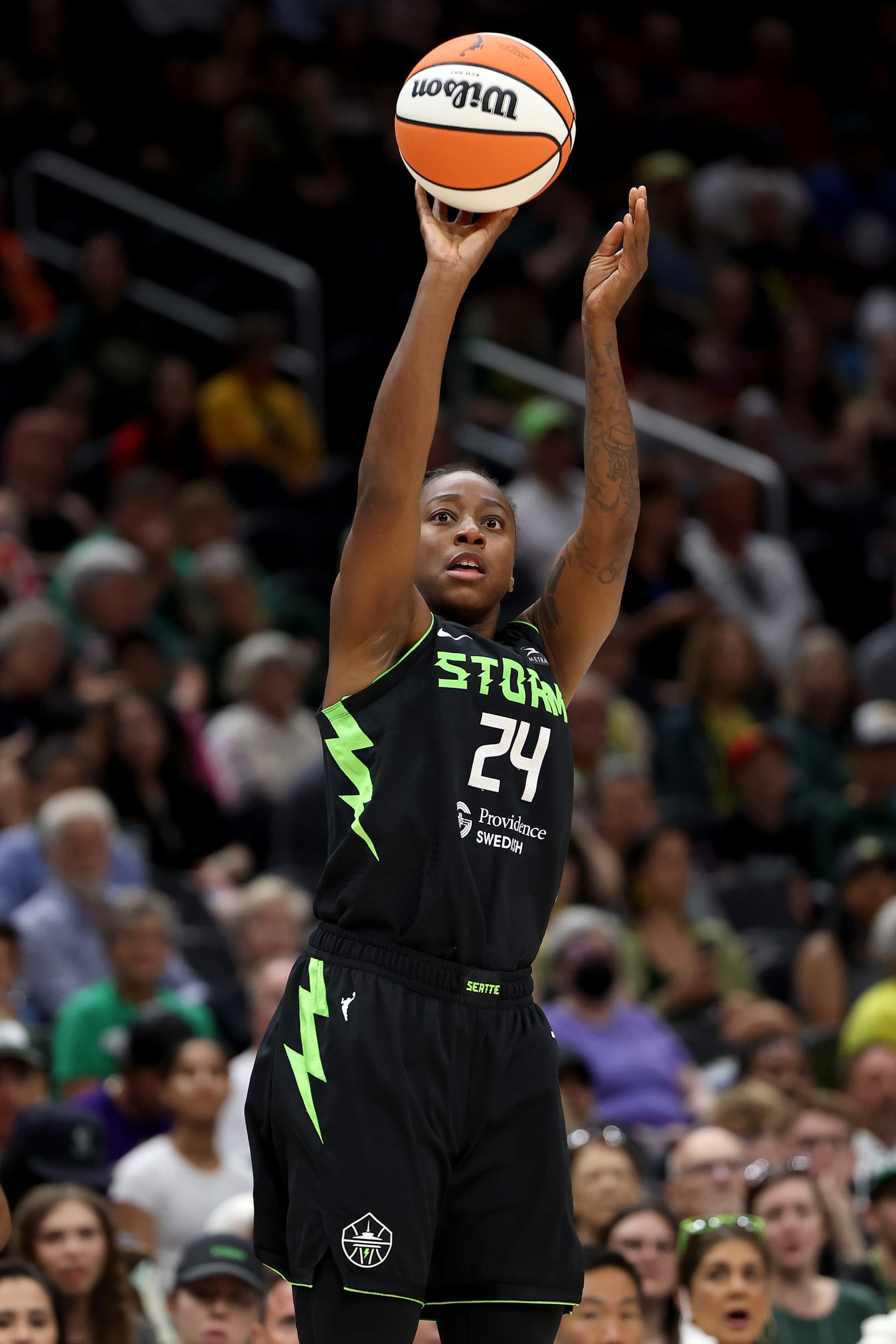
Jewell Loyd in the rebel editionSteph Chambers/Getty Images
The Seattle Storm own a top-two coolest rebel edition now with the force-of-nature theme introduced this season, and I say that with a disclosed aversion to neon green. You can do neon green if you do it with your chest, and the Storm did that with literal lightning bolts. I like the vision and the execution, especially when it comes to the static fuzz font.
I’m OK with the full set as a whole. No. 6 feels appropriate, all things considered.
5. New York Liberty

Juan Ocampo/NBAE via Getty Images
The New York Liberty have never shied away from making a statement or paying homage to their Brooklyn roots. They accomplish both with their current trio of jerseys, with Lady Liberty’s influence flowing throughout in that distinct light blue hue.
The torch is evident, small but tastefully placed in each jersey, adding a layer of cohesiveness to the brand. The rebel editions have “Equality” center-pieced across the chest, representing the team’s ongoing commitment to equality and social justice.
Walking the walk, talking the talk and making it all look good. A uniform set fit for none other than Ellie the Elephant.
4. Atlanta Dream

Tina Charles in Atlanta’s rebel edition jerseyDale Zanine/NBAE via Getty Images
The Atlanta Dream win the “best concepts, solid execution” award for each of their jerseys. The rebel edition is fantastic aesthetically, but it’s even cooler because the hints of silver are a nod to the platinum records coming out of the city with so much hip-hop and cultural influence.
Then you’ve got their explorer (red) and heroine (white) editions that draw inspiration from signs made during civil rights marches with their font.
“The 16 rays on the jersey top are inspired by Atlanta’s National Center for Civil and Human Rights’ ‘Pentagram’ mural that connects the various rights movements and brings them together under one common goal—equality for all,” the Dream explained in a press release. It’s all a perfect way for the Dream to pay respect to such a powerful name in such a forward-facing league.
3. Los Angeles Sparks

Barry Gossage/NBAE via Getty Images
The Los Angeles Sparks’ jersey collection nails the intersection of functional, fun and representative as well as any WNBA franchise. Granted, they started out on easy mode with the iconic Los Angeles yellow and purple, but it’s easier than you’d think to do too much and mess that softball up.
This is why I actually appreciate the simplicity of the new Rebel edition alternates.
Everyone knows immediately that this is a Los Angeles jersey, and it’s clean enough for a layperson to buy and easily incorporate into an everyday streetwear fit—savvy business move as the WNBA continues to blow up in popularity.
Additionally, the palm tree extending from the L in the standard unis is the “just right” amount of seamless fun.
2. Phoenix Mercury
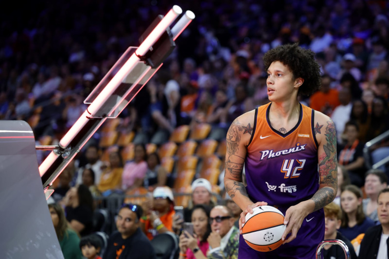
Brittney Griner in the explorer editionAlex Slitz/Getty Images
All three of the Phoenix Mercury’s active jerseys are simply sick. I’d buy any one of them and incorporate them into an outfit.
I need everyone in the professional sports uniform designing industry to understand that this is how you do a white jersey.
Phoenix actually gives us something interesting to look at here with the bubble font and the reverse colors on the team name and individual number. I also love the juxtaposition in size with the team name and number.
Then you’ve got a beautiful gradient on the explorer edition, which is reminiscent of an Arizona sunset.
Finally, you’ve got a distinctly different Rebel Edition that still captures the same vibe the whole collection has. These three jerseys are so beautiful, cohesive, creative and fun.
1. Chicago Sky
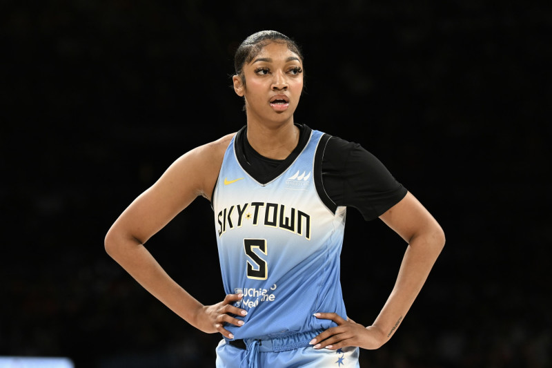
Angel Reese in Chicago’s rebel edition jerseyCandice Ward/Getty Images
Is the Chicago Sky’s Explorer Edition jersey the hardest jersey in all of basketball right now? Look, black jerseys are a contentious subject: They aren’t everyone’s cup of tea, they aren’t a safe bet, and a lot of the time they don’t work. But the Sky’s are a prime example of getting it right.
I’m here for the pinstripes made of Chicago’s city skyline. I’m here for the black and blue. The font outlining is done well with the yellow.
I’m also here for the creative SkyTown direction they took the Rebel jersey in this year. Fun font, fun, cloudy blue backdrop to look at, and a great example of seizing the opportunity to make a statement with the name.
Leave a Reply